Lecture 8: CSS3 Features
CSS3 is the version of CSS that added all the visual polish modern websites rely on — rounded corners, shadows, smooth animations, and custom fonts — without needing a single image file or line of JavaScript. In this lecture you will learn how to use these features to turn a plain, flat-looking page into something that feels modern and alive.
In This Lecture
- Draw rounded corners, gradients, shadows, and control opacity with pure CSS
- Move, rotate, and scale elements in 2D and 3D using transforms
- Animate changes smoothly with transitions and keyframe animations
- Use web fonts and icon fonts, and store reusable values in CSS custom properties (variables)
- Adapt styles to different screens with media and feature queries
- Understand vendor prefixes and why cross-browser compatibility still matters
Rounded Corners, Gradients, Shadows, and Opacity
Before CSS3, giving a box rounded corners meant slicing up a background image in Photoshop and stitching the pieces together with HTML. CSS3 replaced that entire workflow with a handful of properties.
Rounded corners: border-radius
The border-radius property rounds the corners of any element — a <div>, a button, an
image, anything with a box around it.
.card {
  border-radius: 12px; /* all four corners */
}

.avatar {
  border-radius: 50%; /* a perfect circle, if width == height */
}

.speech-bubble {
  border-radius: 20px 20px 20px 0; /* top-left top-right bottom-right bottom-left */
}
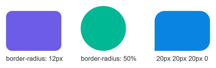
Rendered in a browser, the three shapes side by side:
Percentages vs. pixels
A pixel value (12px) rounds by a fixed amount. A percentage (50%) rounds relative to
the element's own size — that is the trick used to turn a square image into a circle.
Gradients
A gradient is a smooth transition between two or more colors, generated entirely by the browser — no image needed. The two most common kinds are linear (a straight line) and radial (spreading out from a center point).
.banner {
  background: linear-gradient(to right, #4facfe, #00f2fe);
}

.spotlight {
  background: radial-gradient(circle, #fff, #333);
}

.diagonal {
  background: linear-gradient(45deg, orange, red);
}
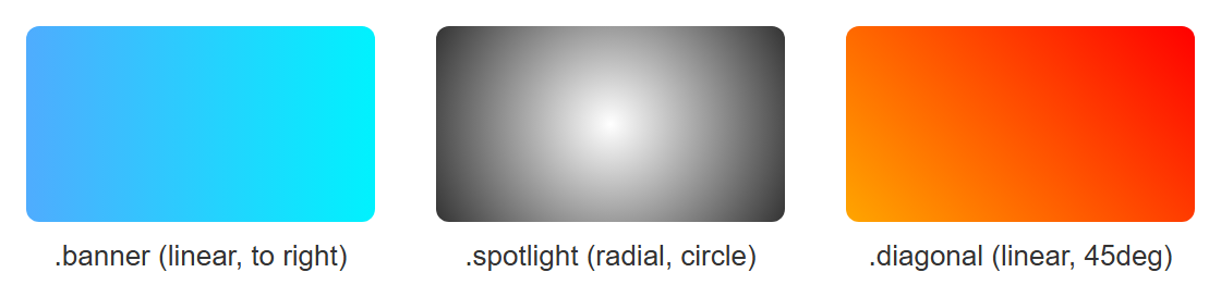
All three gradients rendered together:
You can add as many color "stops" as you like, and even control where each color starts:
.rainbow {
  background: linear-gradient(
    to right,
    red 0%,
    yellow 25%,
    green 50%,
    blue 75%,
    violet 100%
  );
}
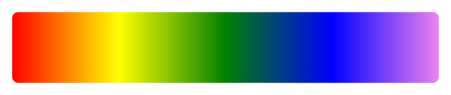
Rendered, the five color stops blend smoothly from red through to violet:
Shadows
CSS gives you two shadow properties: box-shadow for boxes and text-shadow for text.
.card {
  box-shadow: 0 4px 10px rgba(0, 0, 0, 0.2);
  /* offset-x | offset-y | blur-radius | color */
}

.card:hover {
  box-shadow: 0 8px 20px rgba(0, 0, 0, 0.35); /* a bigger shadow on hover */
}

h1 {
  text-shadow: 2px 2px 4px rgba(0, 0, 0, 0.5);
}
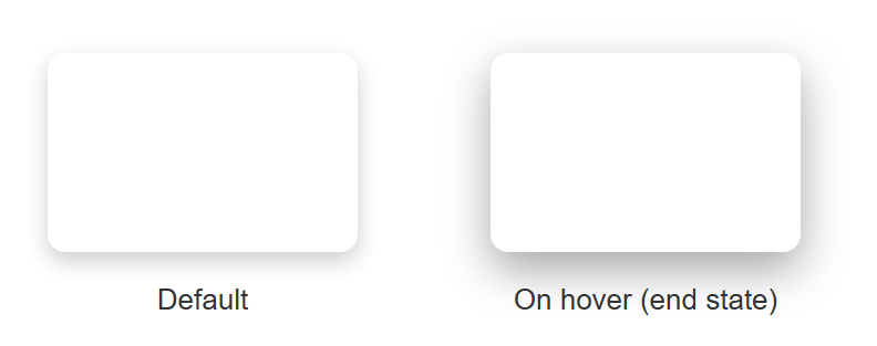
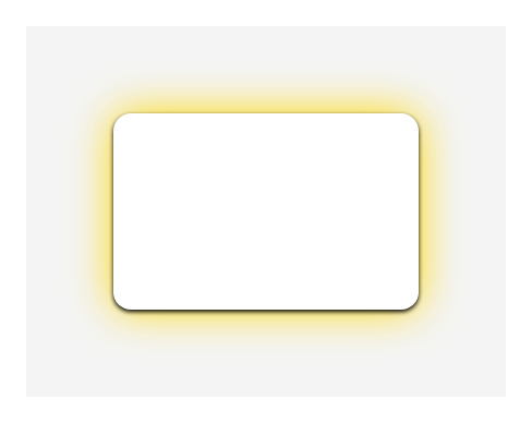
The .card's default box-shadow next to its :hover end state (bigger, softer shadow), and the text-shadow'd heading:

rgba() is a color function that adds a fourth value — alpha, or transparency — on top
of the usual red, green, and blue. rgba(0, 0, 0, 0.2) is black at 20% opacity, which is
why it reads as a soft gray shadow rather than a harsh black block.
Multiple shadows
You can stack shadows by separating them with commas: box-shadow: 0 1px 2px #000, 0 0 20px gold;
draws a subtle drop shadow and a glow at the same time.
Opacity
The opacity property controls how see-through an entire element is, from 0 (fully
invisible) to 1 (fully solid).
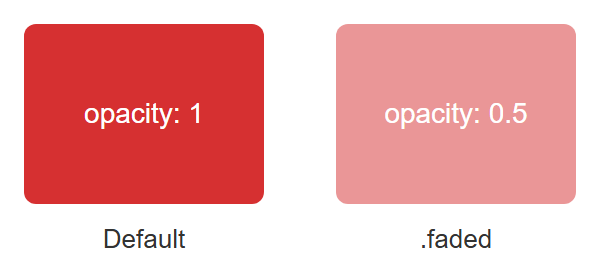
A full-opacity box next to the same box at opacity: 0.5 — notice the text inside fades along with the background:
opacity affects children too
opacity makes everything inside the element transparent, including its text. If you
only want a transparent background but fully solid text, use rgba() (or hsla()) on
the background-color instead of opacity on the whole element.
2D/3D Transforms, Transitions, and Keyframe Animations
Transforms
The transform property changes an element's shape or position without affecting the
layout of the elements around it. This makes it perfect for hover effects and animations,
since it does not cause other elements to jump around.
.box {
  transform: rotate(15deg);
}

.box2 {
  transform: scale(1.2); /* 20% bigger */
}

.box3 {
  transform: translate(50px, 20px); /* move right 50px, down 20px */
}

.box4 {
  transform: skew(10deg, 0deg);
}

/* combine multiple transforms in one declaration */
.box5 {
  transform: translate(20px, 0) rotate(10deg) scale(1.1);
}
An untransformed original square next to each transformed version, for comparison:
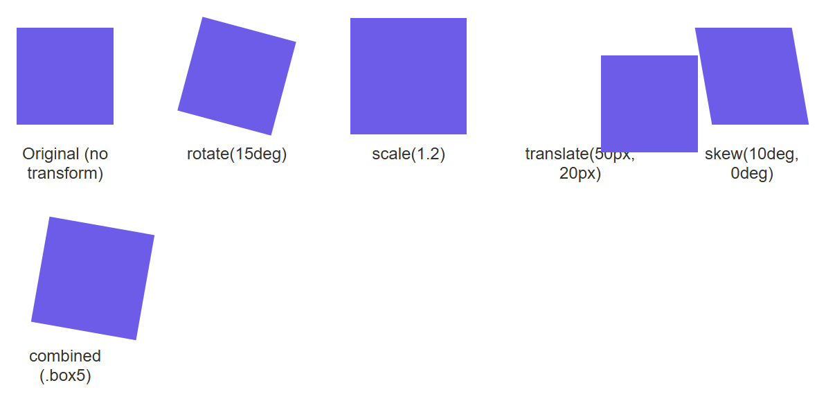
These are all 2D transforms — they move an element around a flat, two-dimensional surface (left/right, up/down, and rotating in that same flat plane).
3D transforms add a third axis (Z), giving the illusion of depth. To make 3D transforms
look correct, the parent element needs perspective, which tells the browser how far away
the "viewer" is from the 3D scene.
.scene {
  perspective: 800px; /* set on the parent */
}

.card-3d {
  transform: rotateY(25deg); /* rotate around the vertical axis */
  transition: transform 0.4s ease;
}

.card-3d:hover {
  transform: rotateY(0deg);
}
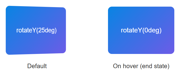
The card at its default rotateY(25deg) angle next to its :hover end state (rotateY(0deg), flat-on) — the perspective: 800px on the parent .scene is what makes the default state look tilted in 3D instead of just squashed:
| Function | What it does |
|---|---|
translate(x, y) / translateZ(z) |
Moves an element |
rotate(deg) / rotateX/Y/Z(deg) |
Spins an element |
scale(n) / scaleX/Y/Z(n) |
Resizes an element |
skew(deg) |
Slants an element |
Transitions
A transition smoothly animates a property from its old value to its new value over a set duration, instead of the change happening instantly.
button {
  background-color: royalblue;
  transition: background-color 0.3s ease, transform 0.3s ease;
}

button:hover {
  background-color: darkblue;
  transform: scale(1.05);
}
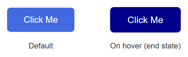
A static screenshot cannot show the smooth animated change itself — that part you have to see by actually hovering the button in a real browser — but it can show the two endpoints the transition moves between: the default button, and the :hover styles applied directly as the end state (darker blue, slightly scaled up):
The transition shorthand takes: property | duration | timing-function | delay. Using
all instead of naming a property (transition: all 0.3s;) animates every property that
changes, which is convenient but can be slower to render on complex pages.
Keyframe animations
Transitions only animate between two states (normal → hover). When you need a more complex
sequence — multiple steps, or an animation that plays automatically without a trigger like
:hover — you use @keyframes.
@keyframes bounce {
  0%   { transform: translateY(0); }
  50%  { transform: translateY(-20px); }
  100% { transform: translateY(0); }
}

.ball {
  animation: bounce 1s ease-in-out infinite;
  /* name | duration | timing-function | iteration-count */
}
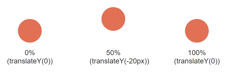
Like the transition above, the actual looping motion only shows up in a live browser. What a still image can show is the three keyframe positions the ball passes through on every cycle:
You define the @keyframes rule once, naming it (bounce), then attach it to any element
with the animation property. infinite means it loops forever; you could instead write
a number like 3 to play it three times.
transition vs. animation
Use a transition for simple state changes (hover, focus, a class being toggled by JavaScript). Use a keyframe animation for anything that plays on its own, loops, or needs more than a start and end state.
Web Fonts, Icon Fonts, and CSS Custom Properties
Web fonts
By default, a browser can only display fonts already installed on the visitor's computer. Web fonts let you embed a font file directly in your site, so every visitor sees the exact same typeface regardless of what they have installed.
The easiest way is Google Fonts, a free library of hosted fonts:
<link rel="preconnect" href="https://fonts.googleapis.com">
<link href="https://fonts.googleapis.com/css2?family=Roboto:wght@400;700&display=swap" rel="stylesheet">
The sans-serif after "Roboto" is a fallback font — if the web font fails to load,
the browser falls back to any generic sans-serif font on the system.
You can also self-host a font file using @font-face:
@font-face {
  font-family: "MyFont";
  src: url("/fonts/myfont.woff2") format("woff2");
  font-weight: 400;
}

h1 {
  font-family: "MyFont", sans-serif;
}
Icon fonts
An icon font is a font where each character maps to a small picture (an icon) instead
of a letter. This lets you use icons like text — resizable with font-size, colorable with
color, and crisp at any zoom level, unlike a raster image.
<link rel="stylesheet"
  href="https://cdnjs.cloudflare.com/ajax/libs/font-awesome/6.5.1/css/all.min.css">

<i class="fa-solid fa-heart"></i>
<i class="fa-solid fa-house" style="color: teal; font-size: 24px;"></i>
Icon fonts vs. SVG icons
Icon fonts (like Font Awesome) were the standard approach for years. Many modern projects now prefer inline SVG icons instead, since SVGs support multi-color icons and are generally more accessible. Both approaches are still widely used — you will meet SVG icons again later in the course.
CSS custom properties (variables)
A CSS custom property — commonly called a CSS variable — lets you store a value once and reuse it throughout your stylesheet. If you ever need to change that value, you edit it in one place instead of hunting through every rule.
Custom properties are declared with two leading dashes, --like-this, and are typically
defined on :root (the top-level element, <html>) so they are available everywhere on
the page:
:root {
  --main-color: #6c5ce7;
  --spacing-unit: 8px;
  --border-radius: 6px;
}

.button {
  background-color: var(--main-color);
  padding: calc(var(--spacing-unit) * 2);
  border-radius: var(--border-radius);
}

.button:hover {
  background-color: var(--main-color-dark, #4834d4);
  /* the second value is a fallback if --main-color-dark isn't defined */
}
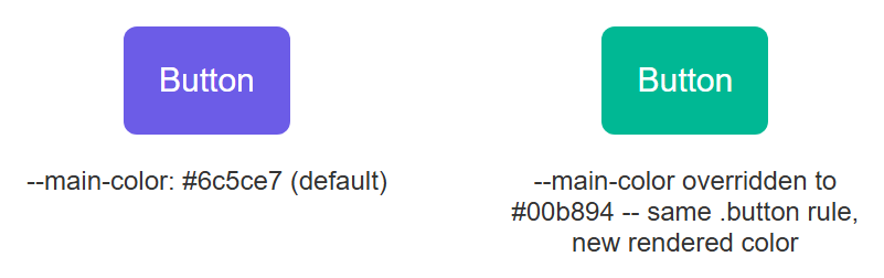
The same .button rule, rendered twice, with nothing changed except the value of --main-color in scope — proof that the variable, not a separate style rule, is what controls the rendered color:
You read a custom property's value with the var() function. Unlike a preprocessor variable
(such as one in Sass), a CSS custom property is a live, real value in the browser — you
can even change it at runtime with JavaScript, and every element using var(--main-color)
updates instantly.
A practical use: theming
Custom properties are the standard way to build a light/dark theme toggle. You define one
set of variables for light mode and swap in a different set of values (often scoped to a
[data-theme="dark"] selector) for dark mode — no need to rewrite every color rule.
Media Queries, Feature Queries, and Cross-Browser Compatibility
Media queries
A media query applies CSS rules only when certain conditions about the screen are true — most commonly, the width of the browser window. This is the foundation of responsive design, which you will study in depth in Lecture 10.
/* base styles, for all screens */
.container {
  width: 100%;
  padding: 16px;
}

/* only applies when the viewport is 768px wide or more */
@media (min-width: 768px) {
  .container {
    width: 750px;
    margin: 0 auto;
  }
}
A static screenshot cannot demonstrate a media query doing its job — the whole point is that the layout changes as the viewport width changes. This is one you need to see by actually resizing a real browser window (or dragging the responsive-mode device toolbar in DevTools) and watching .container snap between its narrow and wide styles as it crosses the 768px threshold.
Feature queries
A feature query, written with @supports, applies CSS only if the visitor's browser
actually supports a given property or value. This lets you safely use a newer CSS feature
while providing a fallback for older browsers.
.layout {
  display: block; /* fallback for browsers without grid support */
}

@supports (display: grid) {
  .layout {
    display: grid;
    grid-template-columns: 1fr 1fr;
  }
}
Every modern browser used to view this book already supports display: grid, so a screenshot here would only ever show the @supports branch winning — it cannot honestly demonstrate the fallback path an older browser would take. Trust the mechanism: @supports checks real, current browser support before applying its block, the same way @media checks real, current viewport size.
Vendor prefixes
Historically, browser makers added experimental support for new CSS features before those features became an official standard, marking them with a vendor prefix so they would not clash with the eventual standard property name.
| Prefix | Browser engine |
|---|---|
-webkit- |
Chrome, Safari, newer Edge |
-moz- |
Firefox |
-ms- |
old Internet Explorer / Edge |
-o- |
old Opera |
.box {
  -webkit-transform: rotate(10deg); /* Safari/old Chrome */
  -moz-transform: rotate(10deg);    /* old Firefox */
  transform: rotate(10deg);         /* standard, always last */
}
Write the standard property last
Always list the unprefixed, standard property after the prefixed ones. If a browser understands both, it will apply whichever rule comes last — so putting the standard version last means modern browsers use the correct, final behavior.
Writing every prefix by hand is tedious and error-prone, so in real projects this is
automated by a build tool called Autoprefixer, which reads your plain CSS and adds
exactly the prefixes still needed based on which browsers you want to support. You will not
be expected to hand-write prefixes for most modern properties (like border-radius or
box-shadow) — they no longer need them in current browsers — but you should recognize them
when you see them in older code, and understand why cross-browser testing still matters:
not every visitor uses the newest version of Chrome.
flowchart LR
    A["You write CSS3 code"] --> B{"Is it a new / experimental feature?"}
    B -- "Yes" --> C["Add vendor prefixes\n-webkit- -moz- -ms- -o-"]
    B -- "No, well supported" --> D["Use the standard property directly"]
    C --> E["Standard property last"]
    E --> F["Test in multiple browsers"]
    D --> F
    F --> G["Consistent look across Chrome, Firefox, Safari, Edge"]
Try It Yourself
- Build a "profile card" component: a rounded box (
border-radius) with a circular avatar image, abox-shadow, and a backgroundlinear-gradientheader. Add atransitionso the whole card lifts slightly (transform: translateY(-5px)) and its shadow grows when the user hovers over it. - Define three CSS custom properties on
:root—--main-color,--accent-color, and--font-heading. Use them across at least four different rules in your stylesheet, then change only the variable values and confirm every usage updates at once. Finally, write a@keyframesanimation that makes a button gently pulse (scale up and down) forever.
Key Takeaways
border-radius, gradients,box-shadow/text-shadow, andopacitylet you build modern visual effects using pure CSS, with no images required.transform(2D and 3D) repositions, rotates, or resizes elements without disturbing page layout; 3D transforms needperspectiveon a parent to look correct.transitionanimates smoothly between two states (like normal and:hover);@keyframesplusanimationdefines multi-step animations that can run automatically and loop.- Web fonts (via
@font-faceor services like Google Fonts) let every visitor see the same typeface; icon fonts let you use scalable icons the same way you use text. - CSS custom properties (
--name, read withvar(--name)) store reusable values in one place and are the standard mechanism behind theming and dark mode. - Media queries (
@media) adapt styles to screen size; feature queries (@supports) adapt styles to what the browser can actually render. - Vendor prefixes (
-webkit-,-moz-,-ms-,-o-) exist for cross-browser compatibility with experimental features; always place the unprefixed standard property last.