Lecture 4: Semantic HTML and HTML Forms
Lecture 3 taught you the raw building blocks of HTML. Now you'll learn how to organize a page in a way that is meaningful — not just to a human reader, but to browsers, search engines, and assistive technology — and how to collect input from your users with HTML forms.
In This Lecture
- Understand the difference between block-level and inline elements
- Use the generic
<div>and<span>elements correctly - Learn HTML5's semantic elements and why they matter for accessibility and SEO
- Build forms with the
<form>element, itsactionandmethodattributes - Use
<input>types,<select>,<textarea>, and<button> - Add client-side validation with
required,pattern,min, andmax
Block-Level vs. Inline Elements
Every HTML element behaves as one of two basic types when the browser lays it out on the page.
Block-level elements always start on a new line and take up the full width available
to them, pushing everything after them down to the next line. Examples include <h1>–<h6>,
<p>, <div>, <ul>, <table>, and <form>.
Inline elements do not start on a new line. They only take up as much width as their
content needs, and sit within a line of text, flowing alongside other content. Examples
include <a>, <span>, <strong>, <em>, and <img>.
<p>This is a block-level paragraph.</p>
<p>This is another block — notice it starts on its own line.</p>

<p>This sentence has an <strong>inline bold word</strong> and an
<a href="#">inline link</a> sitting right in the flow of the text.</p>
Rendered in a browser, the two paragraphs each claim their own line, while the bold word and the link sit inside the flow of the third paragraph's line:

Why this distinction matters
Understanding block vs. inline is essential once you start styling pages with CSS (Lecture 5 onward), because it determines how elements size themselves and flow next to each other by default.
The Generic <div> and <span>
Sometimes you need to group elements together purely for styling or scripting purposes, without the grouping having any special meaning. HTML provides two generic, meaningless containers for exactly this:
<div>(division) — a generic block-level container.<span>— a generic inline container.
<div class="card">
    <p>Some content wrapped in a div so it can be styled as a "card" with CSS.</p>
</div>

<p>The price is <span class="highlight-price">$25</span> today only.</p>
Rendered in a browser with no CSS at all, the class names have zero visual effect — the
"card" div and the highlighted span look exactly like ordinary, unstyled text:

Neither <div> nor <span> tells the browser, a search engine, or a screen reader
anything about what kind of content is inside them — they are pure containers, useful
when no more specific (semantic) element fits. This is exactly the problem semantic
elements were designed to solve.
Semantic HTML
A semantic element is one whose tag name clearly describes the meaning or role of its content, not just its visual appearance. Compare these two ways of marking up the same page:
No screenshot here on purpose
Rendered in a real browser with no CSS, both versions above produce nothing but a stack of empty, invisible containers — there is no visible content inside them to show in a screenshot. That invisibility is exactly the point: the tag name changes what the markup means, not how it looks.
Both versions might look identical in the browser once styled with CSS — semantic elements do not automatically look different. The difference is that the second version tells everyone reading the raw HTML — humans, browsers, search engines, and screen readers — exactly what role each section plays.
The Main Semantic Elements
| Element | Represents |
|---|---|
<header> |
Introductory content for a page or a section (often a logo, title, nav) |
<nav> |
A block of navigation links |
<main> |
The primary, unique content of the page (only one per page) |
<section> |
A thematic grouping of content, usually with its own heading |
<article> |
Self-contained content that could stand alone (a blog post, news story) |
<aside> |
Content tangentially related to the main content (a sidebar, a pull quote) |
<footer> |
Closing content for a page or section (copyright, contact links) |
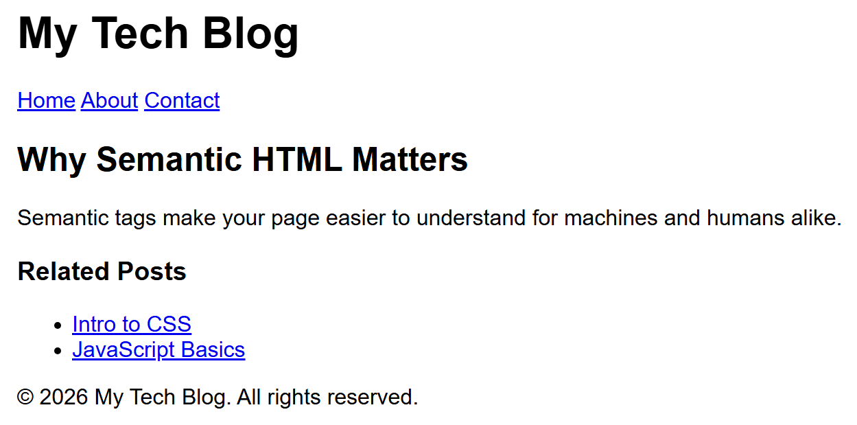
Here is a full, realistic page skeleton using them together:
<body>
<header>
<h1>My Tech Blog</h1>
<nav>
<a href="/">Home</a>
<a href="/about.html">About</a>
<a href="/contact.html">Contact</a>
</nav>
</header>
<main>
<article>
<h2>Why Semantic HTML Matters</h2>
<p>Semantic tags make your page easier to understand for machines and humans alike.</p>
</article>
<aside>
<h3>Related Posts</h3>
<ul>
<li><a href="#">Intro to CSS</a></li>
<li><a href="#">JavaScript Basics</a></li>
</ul>
</aside>
</main>
<footer>
<p>© 2026 My Tech Blog. All rights reserved.</p>
</footer>
</body>
Rendered in a browser, semantic elements have no built-in visual styling of their own — the page is plain, but every section is genuinely there in the markup:
Notice that <section> and <article> are similar. Use <article> when the content makes
sense entirely on its own, even if copied to a completely different site (a blog post, a
product listing). Use <section> for a grouping of related content that is part of the
larger page, usually introduced by its own heading, but not meant to stand alone.
Why Semantics Matter: Accessibility and SEO
Accessibility means designing your site so that people with disabilities can use it
too — for example, someone who is blind and uses a screen reader, a program that reads
the page aloud. Screen readers use semantic tags to let users jump directly to the
navigation, skip straight to the main content, or list all the "landmarks" on a page. A
page built entirely out of <div> tags gives a screen reader nothing to work with; the
user has to listen to the entire page top to bottom to find anything.
SEO (Search Engine Optimization) is the practice of structuring your site so that
search engines like Google can understand it and rank it well in search results. Search
engines give more weight to content inside <article>, <main>, and proper headings than
to content buried inside anonymous <div> tags, because semantic tags help the search
engine understand what your page is actually about.
Rule of thumb
Reach for a semantic element first. Only fall back to <div> or <span> when no
semantic element accurately describes what you're grouping.
HTML Forms
A form lets your page collect input from the user — text, choices, files — and send it
somewhere for processing, typically to a server. Every form starts with the <form>
element.
<form action="/submit-login" method="POST">
    <label for="username">Username:</label>
    <input type="text" id="username" name="username">

    <label for="password">Password:</label>
    <input type="password" id="password" name="password">

    <button type="submit">Log In</button>
</form>
Rendered in a browser, with no CSS to force the fields onto separate lines, the labels and inputs simply flow together left to right like any other inline content:

The action and method Attributes
action— the URL that the form's data will be sent to when submitted. If omitted, the form submits to the current page's own URL.method— the HTTP method used to send the data. The two most common values are:GET— appends the form data to the URL as a query string (e.g.?username=ali). Visible in the address bar, bookmarkable, and suitable for searches or anything that does not change data on the server.POST— sends the form data in the body of the request, invisible in the URL. Suitable for anything that creates, changes, or deletes data (logging in, submitting a purchase, posting a comment) and for sensitive data like passwords.
Never use GET for passwords or sensitive data
Because GET puts form values directly into the URL, that data can end up saved in
browser history, server logs, and shared if the link is copied. Always use POST for
passwords and other sensitive information.
You will learn much more about HTTP methods and servers in later lectures (Unit 5). For
now, just remember: GET reads/retrieves, POST submits/changes.
Here is the journey a form's data takes when the user clicks submit:
sequenceDiagram
    participant U as User (Browser)
    participant S as Server

    U->>U: Fills in form fields
    U->>U: Clicks Submit button
    U->>S: HTTP request (GET or POST) to the "action" URL,<br/>carrying the form data
    S->>S: Processes the data
    S-->>U: Sends back a response (e.g. a new page)
The <label> Element
Every input should be paired with a <label>. The for attribute on <label> must match
the id attribute on the input it describes:
This connection is not just cosmetic — clicking the label text also focuses/activates the
matching input, and screen readers announce the label when the user reaches the input.
Always give inputs a name attribute as well; it is the key used to identify that field's
value when the form data is sent to the server.
Input Types
The <input> element is the most flexible form control. Its type attribute determines
what kind of control the browser displays and what kind of data it expects:
<input type="text" name="fullname" placeholder="Full name">
<input type="email" name="email" placeholder="you@example.com">
<input type="password" name="password">
<input type="number" name="age" min="1" max="120">
<input type="date" name="birthday">
<input type="checkbox" name="subscribe" checked>
<input type="radio" name="gender" value="male"> Male
<input type="radio" name="gender" value="female"> Female
<input type="file" name="resume">
<input type="range" name="volume" min="0" max="100">
<input type="color" name="favcolor">
<input type="submit" value="Send">
<input type="hidden" name="formVersion" value="2">
Rendered in a browser, each type produces a genuinely different native control — this is
one of the clearest illustrations of how much the browser does for you with plain HTML:
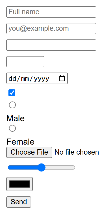
A little extra CSS (display: block on every <input>) was added purely so each type
stacks on its own line for a legible screenshot — the input elements, types, and attributes
themselves are exactly as shown in the code above.
| Type | Purpose |
|---|---|
text |
A single line of free text |
email |
Text that the browser checks looks like an email address |
password |
Text hidden as dots/asterisks while typing |
number |
Numeric input, often with up/down arrows |
date |
A date picker |
checkbox |
An on/off box; several with the same name can all be checked |
radio |
A choice among mutually exclusive options; give them the same name |
file |
Lets the user pick a file to upload |
range |
A slider between a min and max value |
color |
A color picker |
submit |
A button that submits the form |
hidden |
Not shown to the user, but sent along with the form data |
placeholder shows light gray hint text inside an empty input; it disappears once the user
starts typing, and it is not a substitute for a <label>.
<select>, <textarea>, and <button>
<select> creates a dropdown list, built out of <option> children:
<label for="course">Choose a course:</label>
<select id="course" name="course">
    <option value="csc336">Web Technologies</option>
    <option value="csc337" selected>Advanced Web Technologies</option>
    <option value="csc241">Object Oriented Programming</option>
</select>
Rendered in a browser, the dropdown shows the selected option's text by default:

The selected attribute pre-selects an option; the value attribute is what gets sent to
the server (which can differ from the visible text).
<textarea> creates a multi-line text box — unlike <input type="text">, which is
always one line:
<label for="message">Message:</label>
<textarea id="message" name="message" rows="5" cols="40">Type here...</textarea>
Rendered in a browser, the rows/cols attributes size the visible box, and the text
between the tags appears pre-filled inside it:
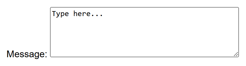
Note that the default text goes between the opening and closing tags, not in a value
attribute.
<button> creates a clickable button and is more flexible than <input type="submit">
because it can contain other HTML (like an icon) inside it:
<button type="submit">Submit</button>
<button type="reset">Clear Form</button>
<button type="button">Just a Button (does nothing by itself)</button>
All three render as ordinary clickable buttons — nothing about their appearance reveals
which type they are; only their behavior differs when clicked inside a real form:

type="submit"(the default inside a form) submits the form.type="reset"clears all fields back to their default values.type="button"does nothing on its own — it's meant to be wired up with JavaScript later (Unit 4).
HTML5 Client-Side Validation
Validation means checking that the data the user typed is acceptable before it gets sent anywhere. Client-side validation happens right in the browser, instantly, without needing to contact the server at all. HTML5 added several attributes that let the browser do simple validation automatically, with zero JavaScript required.
<form action="/register" method="POST">
    <label for="uname">Username (required):</label>
    <input type="text" id="uname" name="uname" required>

    <label for="cnic">CNIC (format 00000-0000000-0):</label>
    <input type="text" id="cnic" name="cnic"
           pattern="\d{5}-\d{7}-\d" title="Format: 00000-0000000-0">

    <label for="age">Age (18–60):</label>
    <input type="number" id="age" name="age" min="18" max="60">

    <button type="submit">Register</button>
</form>
Rendered in a browser, the fields themselves look like any other text/number input:

The validation messages themselves are not visible in a static screenshot — a small warning bubble like "Please fill out this field" or "Please match the requested format" only appears in a real browser when you try to submit the form with invalid or missing data.
required— the field cannot be left empty. The browser blocks submission and shows a small warning bubble pointing at the missing field.pattern— a regular expression (a pattern for matching text) that the value must match. In the example above,\d{5}-\d{7}-\drequires exactly 5 digits, a dash, 7 digits, a dash, and 1 digit — the format of a Pakistani CNIC number. Pairingpatternwith atitleattribute gives the user a readable hint about the expected format.minandmax— set the lowest and highest acceptable values for numeric (type="number") or date-based inputs. Combined withstep, you can also control the allowed increment (e.g.step="5").
Client-side validation is not enough on its own
A user can disable JavaScript, edit the HTML in their browser's developer tools, or send requests directly without ever loading your page at all. Client-side validation is a convenience that gives instant feedback and reduces unnecessary server requests — it is not security. Later, in Unit 5, you will learn to also validate every submission again on the server, which is the check that actually matters for protecting your application.
Other useful validation-related attributes
maxlength / minlength limit the number of characters in a text field, and
disabled prevents a field from being edited or submitted at all. readonly shows the
field but the user cannot change its value.
Try It Yourself
- Build a simple "Contact Us" page using semantic elements: a
<header>with a page title and a<nav>with three links, a<main>containing a<section>that introduces the page, and a<footer>with a copyright line. - Inside the
<main>, add a contact<form>withmethod="POST". Include: a required text input for the sender's name, anemailinput, a<select>for "Reason for contact" (with at least 3 options), a<textarea>for the message, and a submit<button>. Add apatternto a phone-number field so it only accepts digits, and setmin/maxon a numeric "how many people in your group?" field.
Key Takeaways
- Block-level elements start a new line and fill the available width; inline elements flow within a line of text.
<div>and<span>are generic, meaningless containers — use them only when no semantic element fits.- Semantic elements (
<header>,<nav>,<main>,<section>,<article>,<aside>,<footer>) describe the role of content, improving accessibility for screen readers and boosting SEO. - The
<form>element'sactionsets where data is sent, andmethod(GETorPOST) sets how it's sent; usePOSTfor anything sensitive or data-changing. <input type="...">covers most form controls;<select>gives a dropdown,<textarea>gives multi-line text, and<button>triggers submit/reset/custom actions.required,pattern,min, andmaxprovide instant client-side validation, but must always be backed up by server-side validation for real security.- Always pair form inputs with
<label>elements connected via matchingfor/idattributes.