Lecture 7: CSS Positioning and Stacking
So far you have styled elements and controlled their box size, but every element has still been sitting exactly where the HTML put it. This lecture is about taking elements out of that default arrangement — moving them, pinning them, layering them on top of each other — using CSS positioning. You will also learn about floats, an older layout tool that you will still encounter in real code.
In This Lecture
- Normal document flow and static positioning
- The four positioning schemes:
relative,absolute,fixed, andsticky - Offset properties (
top,right,bottom,left) and the containing block z-indexand stacking contexts- Floats, clearing, and common layout pitfalls
Normal Document Flow and Static Positioning
Normal document flow is the default way browsers lay out HTML: elements are placed one after another, in the order they appear in the HTML, from top to bottom (for block-level elements) or left to right (for inline elements). This is what you have been seeing in every example so far — nothing special is happening, the browser is just placing boxes in source order.
Every element has a position property, and its default value is static. Static
positioning simply means "follow normal document flow — don't do anything special."
An important rule: offset properties (top, right, bottom, left) have no effect on
a statically positioned element. They only start to matter once you switch to one of the
other positioning schemes.
The Positioning Schemes
CSS offers four ways to move an element out of normal flow: relative, absolute,
fixed, and sticky.
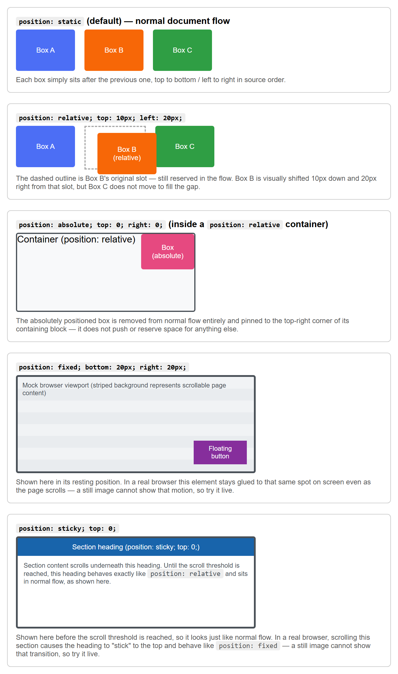
Rather than a diagram, the clearest way to see what each value actually does is to render each one and compare it against normal flow directly. Each panel below uses the exact offset values shown in this lecture's code examples:
relative
position: relative keeps the element in normal document flow — its original space is
still reserved, as if it hadn't moved — but then shifts it visually using the offset
properties, relative to where it would normally have been.
.box {
  position: relative;
  top: 10px;   /* moves it 10px down from its normal position */
  left: 20px;  /* moves it 20px right from its normal position */
}
Other elements on the page behave as though .box never moved — the gap it left behind in
normal flow is not filled in.
absolute
position: absolute removes the element from normal flow entirely — other elements now
behave as if it doesn't exist, and can slide into the space it used to occupy. The element
is then positioned using the offset properties, but relative to its containing block
(explained below), not relative to where it used to sit.
fixed
position: fixed also removes the element from normal flow, but positions it relative to
the browser viewport (the visible window), not any particular ancestor. A fixed element
stays in the same place on screen even when the page is scrolled — commonly used for sticky
headers, "back to top" buttons, or chat widgets.
sticky
position: sticky is a hybrid: the element behaves like relative (normal flow) until the
page is scrolled to a certain point, at which point it "sticks" and behaves like fixed
within its parent's boundaries. It is commonly used for section headings that stay visible
while their section scrolls past.
sticky needs a threshold
position: sticky requires at least one offset property (usually top) to define the
threshold at which it should start sticking. Without an offset, it behaves just like
relative.
Offset Properties and the Containing Block
The offset properties — top, right, bottom, left — tell a positioned element how
far to shift from an edge. They only apply to elements whose position is relative,
absolute, fixed, or sticky.
For absolute and fixed elements, offsets are measured against the element's
containing block — the ancestor box that positioning is calculated relative to.
- For
position: fixed, the containing block is the viewport (or a transformed ancestor, an advanced edge case you don't need to worry about yet). - For
position: absolute, the containing block is the nearest ancestor whosepositionis anything other thanstatic— that is, the nearest ancestor that isrelative,absolute,fixed, orsticky. If no ancestor is positioned, it falls back to the initial containing block, which is essentially the whole page.
This is why you will very often see a pattern like this:
.card {
  position: relative; /* establishes a containing block for children */
}

.card .badge {
  position: absolute;
  top: 8px;
  right: 8px; /* positioned relative to .card, not the whole page */
}
Rendered in a browser, the badge sits pinned to the card's own top-right corner:
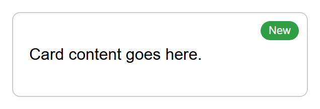
Here, .card is given position: relative for the sole purpose of becoming the containing
block for .badge, so the badge sits in the corner of the card instead of the corner of
the entire browser window.
The relative-parent, absolute-child pattern
"Set the parent to relative, set the child to absolute" is one of the most common
patterns in CSS. Get comfortable with it — you will use it for badges, tooltips, dropdown
menus, modal close buttons, and much more.
z-index and Stacking Contexts
When positioned elements overlap, which one appears on top? This is controlled by
stacking order, and you can influence it with the z-index property.
z-index accepts a number (positive, negative, or zero). Among elements that overlap, the
one with the higher z-index is drawn on top.
.back {
  position: absolute;
  z-index: 1;
}

.front {
  position: absolute;
  z-index: 2; /* drawn on top of .back */
}
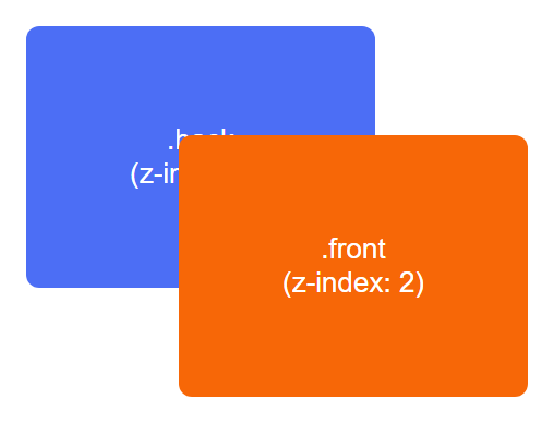
Rendered in a browser, with the two boxes overlapping by design, .front visibly covers
part of .back because its z-index is higher:
z-index only works on positioned elements
z-index has no effect on elements whose position is static (the default). The
element must be relative, absolute, fixed, or sticky for z-index to do
anything.
Stacking Contexts
A stacking context is a self-contained layer for z-index comparisons. Certain CSS
properties cause an element to create a new stacking context for itself and all its
children — for example, setting a position other than static together with a z-index,
or using opacity less than 1, or transform.
The important consequence: z-index values are only compared within the same stacking
context. An element with z-index: 9999 inside one stacking context can still end up
behind an element with z-index: 1 in a different, higher-level stacking context — because
the whole first stacking context is treated as a single unit when compared to elements
outside it.
Debugging stacking issues
If you set a huge z-index and an element still won't come to the front, the most
likely cause is that it is trapped inside a stacking context created by one of its
ancestors. The fix is usually to adjust the z-index (or position) of that ancestor,
not the element itself.
Floats, Clearing, and Common Layout Pitfalls
Floats
The float property was originally designed to let text wrap around an image, like in a
newspaper layout. Before flexbox and grid existed (covered in a later lecture), developers
also (mis)used floats to build entire multi-column page layouts.
<div>
  <img class="image" src="photo.jpg" alt="A photo">
  <p>This paragraph text will wrap around the floated image, flowing along its right side
  instead of starting below it.</p>
</div>
Rendered in a browser (with a placeholder image standing in for photo.jpg), the paragraph
text wraps along the right side of the floated image instead of starting below it:
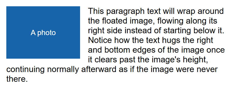
A floated element is taken out of normal flow horizontally: it shifts to the left or right edge of its container, and other inline content flows around it.
Clearing Floats
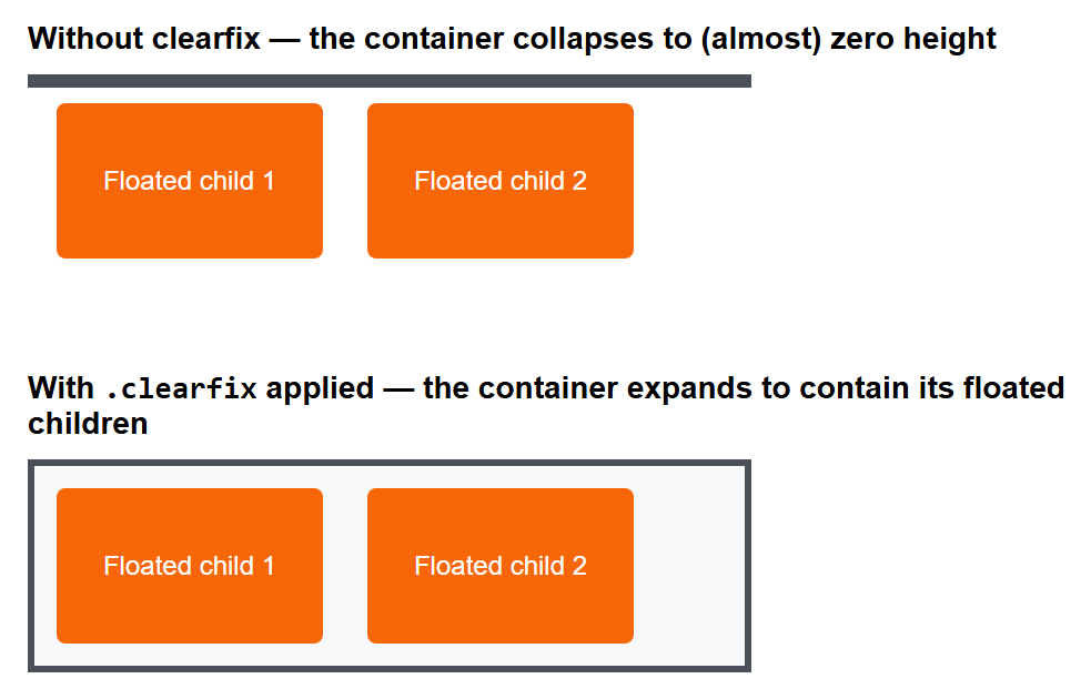
A well-known pitfall: if every child inside a container is floated, the container often collapses to zero height, because floated elements no longer "count" toward their parent's height in normal flow. This is sometimes called the collapsing parent problem.
Applying a class like .clearfix (using the clear property) to the parent forces it to
account for the height of its floated children again. The clear property tells an element
"do not sit beside a floated element on this side — move below it instead," which is what
makes this trick work.
The difference is easy to miss in prose but obvious once rendered side by side — the same
container and floated children, with and without .clearfix applied:
Floats vs. modern layout
Floats are still found in a lot of existing code, and it's worth understanding them for that reason. But for new layouts, flexbox and grid (covered in Lecture 9) are far more powerful and predictable — you generally should not reach for floats for page layout today.
Common Layout Pitfalls
- Forgetting a containing block. Setting
position: absolutewithout arelativeancestor makes the element jump to a position relative to the entire page, which is rarely what beginners intend. - Overlapping content unexpectedly. Removing an element from flow with
absoluteorfixedmeans it no longer pushes other content out of the way — it can end up overlapping other elements if you are not careful with offsets and sizing. - z-index "not working." As covered above, this is almost always a stacking context issue on an ancestor, not a wrong z-index value.
- Collapsed containers from floats. As covered above, a container with only floated children collapses in height unless it is cleared.
- Confusing
fixedinside a scroll container. Aposition: fixedelement is fixed to the viewport, not to a scrolling<div>— if you wanted it to stay pinned within just that div while it scrolls, you likely wantstickyinstead.
Try It Yourself
- Build a "profile card": a
<div class="card">withposition: relative, containing a name, a short bio, and a small<span class="status">Online</span>badge. Style.statuswithposition: absolute; top: 10px; right: 10px;and give it a green background. Confirm the badge sits inside the card's corner rather than the page's corner. - Create two overlapping boxes using
position: absolute, each about 100px by 100px, with different background colours, positioned so they overlap by 30px. Give themz-index: 1andz-index: 2respectively and confirm the one with the higher value renders on top. Then wrap the first box (the one withz-index: 2) in a parent<div>withposition: relative; z-index: 1;, and observe how it now renders behind the second box — this demonstrates a stacking context trapping its child's z-index.
Key Takeaways
- Normal document flow places elements top-to-bottom / left-to-right in source order;
position: static(the default) means "stay in normal flow," and offset properties do nothing on static elements. relativeshifts an element from its own normal spot while still reserving its original space;absoluteandfixedremove the element from flow entirely and position it against a containing block;stickybehaves likerelativeuntil a scroll threshold, then likefixed.- The containing block for an absolutely positioned element is its nearest ancestor
with a non-static
position— the "relative parent, absolute child" pattern relies on this. z-indexonly compares elements within the same stacking context; a high z-index can still lose to a lower one if it's trapped inside a different stacking context.- Floats pull an element to one side and let inline content wrap around it; a container with only floated children can collapse in height unless it is cleared.
- Prefer flexbox and grid for modern page layout; understand floats mainly to read and maintain older code.