Creating Your First HTML + CSS Application
This tutorial puts everything from the HTML and CSS fundamentals together into one real, finished page: a simple personal "About Me" page. No frameworks, no JavaScript — just semantic HTML and CSS you already know, combined into something you can actually be proud of and show someone. By the end, you'll have a working two-file project and a clear mental model of how every line of CSS connects to what you see on screen.
Prerequisites: HTML and HTML5 Fundamentals
and CSS through the box model
(colors, fonts, spacing, borders, border-radius, box-shadow). This project
deliberately does not use Flexbox, Grid, or position — those come later, and a
solid page like this one doesn't need them yet.
In This Tutorial
- Plan a simple page's sections before writing any code
- Set up a two-file project:
index.htmlandstyle.css - Build the HTML structure with semantic tags
- Style it with CSS: colors, the box model, rounded corners, shadows, and a hover effect
- See the finished, real result and understand what every rule is doing
- Get ideas for extending the page yourself
Part 1: Plan Before You Code
Before opening an editor, decide what sections the page actually needs. For this project:
- A header with a name, a small circular avatar, and a short tagline
- An About Me section — a paragraph introducing yourself
- A skills/learning section — a short list
- A contact section — a way to reach you (an email link is enough for now)
- A footer with a copyright line
Sketching this out first (even just as a list, like above) means you're never staring at a blank file wondering what to build next — you already have a checklist.
Part 2: Set Up Your Project Folder
Create a new folder, and inside it, two empty files: index.html and style.css. Link
the stylesheet from the HTML file's <head>, exactly as you learned in
CSS Fundamentals:
Using an external stylesheet (rather than inline styles or an internal <style>
block) means your HTML stays focused on content and structure, and every style rule
lives in one organized place.
Part 3: Build the HTML Structure
Here is the complete index.html. Notice it's built entirely from tags you already
know — a <header>, <main> with three <section>s inside it, and a <footer> — plus
one small, hand-made "avatar" using a styled <div> with initials, so the page needs no
external image file at all.
<!DOCTYPE html>
<html lang="en">
<head>
<meta charset="UTF-8">
<meta name="viewport" content="width=device-width, initial-scale=1.0">
<title>Muhammad Hassan - About Me</title>
<link rel="stylesheet" href="style.css">
</head>
<body>
<div class="container">
<header class="profile-header">
<div class="avatar">MH</div>
<h1>Muhammad Hassan</h1>
<p class="tagline">BSCS Student · Aspiring Web Developer</p>
</header>
<main>
<section class="about">
<h2>About Me</h2>
<p>
I'm a 5th-semester Computer Science student learning how the web
works, one lecture at a time. This page is my very first project
built entirely with HTML and CSS - no frameworks, no JavaScript,
just the fundamentals.
</p>
</section>
<section class="skills">
<h2>What I'm Learning</h2>
<ul>
<li>HTML5 & Semantic Markup</li>
<li>CSS Fundamentals & the Box Model</li>
<li>Responsive Design</li>
<li>JavaScript (coming soon)</li>
</ul>
</section>
<section class="contact">
<h2>Get In Touch</h2>
<p>Have a question about this page? Send me an email.</p>
<a class="btn" href="mailto:muhammad.hassan@example.com">Email Me</a>
</section>
</main>
<footer>
<p>© 2026 Muhammad Hassan. Built with HTML & CSS.</p>
</footer>
</div>
</body>
</html>
A few things worth noticing:
- Everything is wrapped in one
<div class="container">. This is the single element CSS will use to center the whole page and give it a card-like shape. class="avatar",class="profile-header",class="tagline", andclass="btn"don't do anything by themselves — they're just hooks for the CSS you'll write next, exactly like you learned with class selectors.- Replace
"Muhammad Hassan", the initials, the tagline, and the email address with your own — this is your page.
Part 4: Style It With CSS
Here is the complete style.css. Read it top to bottom — every rule is something from
the CSS fundamentals and box model material, just applied together on a real page.
:root {
  --color-primary: #2b2b7a;
  --color-accent: #ff8a3d;
  --color-bg: #f4f4f8;
  --color-card: #ffffff;
  --color-text: #333333;
}

* {
  box-sizing: border-box;
}

body {
  margin: 0;
  font-family: Arial, Helvetica, sans-serif;
  background-color: var(--color-bg);
  color: var(--color-text);
}

.container {
  max-width: 600px;
  margin: 40px auto;
  background-color: var(--color-card);
  border-radius: 12px;
  box-shadow: 0 4px 16px rgba(0, 0, 0, 0.08);
  overflow: hidden;
}

.profile-header {
  background-color: var(--color-primary);
  color: white;
  text-align: center;
  padding: 40px 20px;
}

.avatar {
  width: 80px;
  height: 80px;
  line-height: 80px;
  margin: 0 auto 16px;
  border-radius: 50%;
  background-color: var(--color-accent);
  color: white;
  font-size: 28px;
  font-weight: bold;
  text-align: center;
}

.profile-header h1 {
  margin: 0 0 4px;
}

.tagline {
  margin: 0;
  opacity: 0.85;
}

main {
  padding: 30px;
}

section {
  margin-bottom: 30px;
}

section:last-child {
  margin-bottom: 0;
}

h2 {
  color: var(--color-primary);
  border-bottom: 2px solid var(--color-bg);
  padding-bottom: 8px;
}

.skills ul {
  padding-left: 20px;
}

.skills li {
  margin-bottom: 6px;
}

.btn {
  display: inline-block;
  margin-top: 10px;
  padding: 10px 20px;
  background-color: var(--color-accent);
  color: white;
  text-decoration: none;
  border-radius: 6px;
  font-weight: bold;
  transition: background-color 0.2s ease, transform 0.2s ease;
}

.btn:hover {
  background-color: #e67528;
  transform: translateY(-2px);
}

footer {
  text-align: center;
  padding: 16px;
  font-size: 13px;
  color: #777;
  border-top: 1px solid var(--color-bg);
}
Walking through the interesting parts:
:rootcustom properties. Five colors are defined once at the top and reused withvar(--color-name)everywhere else. Change--color-primaryin one place, and the header, headings, and border colors all update together.* { box-sizing: border-box; }. This changes howwidth/heightare calculated for every element (recall the box model: withborder-box, padding and border are included inside the stated width, instead of added on top of it). Most real projects set this globally, right at the top of the stylesheet, for exactly this reason..containerusesmax-width: 600pxwithmargin: 40px auto. This is the classic beginner-friendly centering trick: an element with a fixedmax-widthandmargin: autoon the left/right centers itself horizontally in the page — no Flexbox or Grid required..avataris centered text inside a circle usingline-heightequal to the circle'sheight— another simple, pre-Flexbox trick for vertically centering a single line of text inside a box..btn:hoverchanges the background color and nudges the button up slightly (translateY(-2px)) on hover, smoothed over 0.2 seconds by thetransitionproperty — a small touch that makes the page feel interactive without any JavaScript at all.
Part 5: See It Running
Open index.html directly in your browser (double-click it, or right-click → Open
With). Here is what this exact HTML and CSS produce:
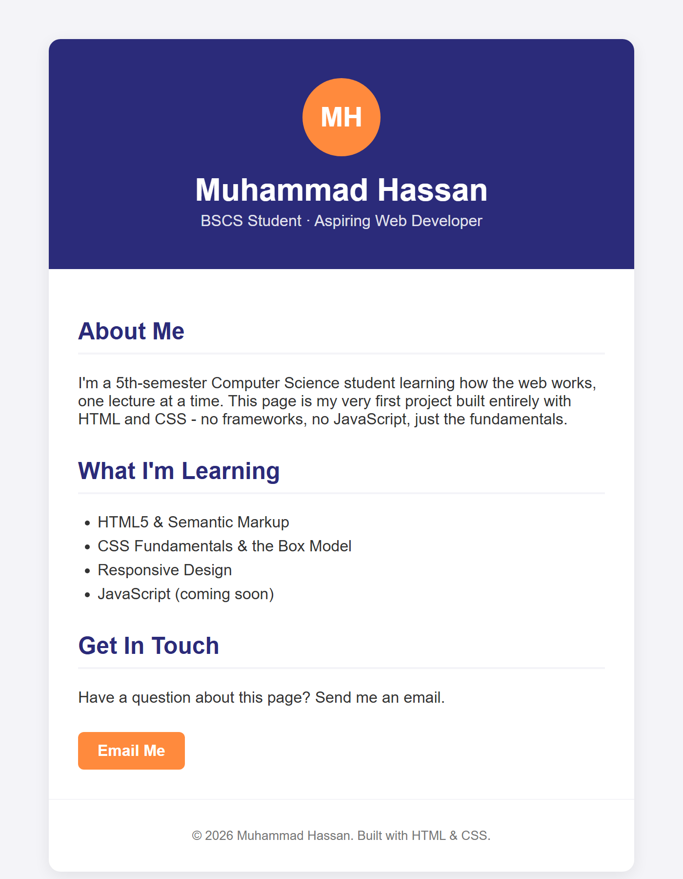
Try hovering your mouse over the Email Me button in your own browser — you'll see the
color change and the slight upward movement that .btn:hover and transition produce
together, something a still screenshot can't show.
Try It Yourself
- Replace the name, initials, tagline, about text, skills, and email address with your
own, and change
--color-primaryand--color-accentto a color scheme you like. - Add a fourth section — a "Projects" section with a short paragraph or a list of things you've built or want to build.
- Replace the initials
<div class="avatar">with a real photo instead: add<img src="photo.jpg" alt="A photo of Muhammad Hassan" class="avatar">in the HTML (an<img>can take the sameclass="avatar"styling), and addobject-fit: cover;to the.avatarCSS rule so a rectangular photo still fills the circle correctly. - Add a second button next to "Email Me" — for example a link to a GitHub profile —
reusing the same
.btnclass so it automatically matches the existing style.
Key Takeaways
- A real page is just familiar HTML tags and CSS rules, combined — nothing you built here required anything beyond HTML structure and the CSS box model.
:rootcustom properties let you define a color scheme once and reuse it everywhere, making the whole page easy to re-theme later.max-width+margin: autocenters a block element without needing Flexbox or Grid — a genuinely useful technique on its own, not just a beginner stepping stone.- Small touches like a
:hoverstate with atransitionmake a plain page feel noticeably more polished, with only a few lines of CSS and no JavaScript.