Building a Multilevel Navigation Menu with Positioning
A dropdown navigation menu is one of the best real-world uses of CSS positioning: the
combination of position: relative on a parent and position: absolute on a child is
the standard technique behind almost every dropdown, flyout, and mega-menu you've ever
clicked on the web. This tutorial builds one from scratch, one level at a time — a simple
horizontal menu bar first, then a dropdown for a second level — and then leaves the third
level as a challenge for you to work out yourself, using exactly the same idea applied
one layer deeper.
Prerequisites: CSS Positioning (specifically position:
relative/absolute and stacking with z-index) and, for the horizontal menu bar,
Flexbox. If you'd rather see the pre-Flexbox way of building a horizontal
menu, compare this with the float-based nav menu in
Layout Designing — both produce a similar-looking result from
different techniques.
In This Tutorial
- Build a simple, single-level horizontal navigation bar
- Add a second level: a dropdown submenu that appears below one menu item
- Understand exactly why "relative on the parent, absolute on the child" is the standard dropdown pattern — not just memorize it
- Take on the challenge of adding a third-level flyout submenu yourself
Part 1: A Single-Level Horizontal Navigation Bar
Start with the simplest possible version: one row of links, no dropdowns yet. A
navigation menu is naturally a list of links, so it's built with a <ul> inside a
<nav> landmark element, laid out horizontally with display: flex.
<nav id="main-nav">
<ul class="nav-level-1">
<li><a href="#">Home</a></li>
<li><a href="#">About</a></li>
<li><a href="#">Services</a></li>
<li><a href="#">Contact</a></li>
</ul>
</nav>
#main-nav {
background-color: #2b2b7a;
}
.nav-level-1 {
display: flex;
list-style: none;
margin: 0;
padding: 0;
}
.nav-level-1 li a {
display: block;
padding: 16px 20px;
color: white;
text-decoration: none;
font-weight: bold;
}
.nav-level-1 li a:hover {
background-color: #ff8a3d;
}

A few things worth noting before adding a second level:
display: flexon the<ul>is what makes the<li>items sit in a row instead of stacking vertically (a plain list's normal behavior).<a>is givendisplay: blockso the entire padded area around each link becomes clickable, not just the text itself — a small but important usability detail.- Nothing here is positioned yet — every element is still in normal document flow
(
position: static, the default). That changes in Part 2.
Part 2: Adding a Second Level — the Dropdown
Now make "Services" reveal a dropdown submenu. The submenu is just another <ul>,
nested inside the <li> it belongs to:
<nav id="main-nav">
<ul class="nav-level-1">
<li><a href="#">Home</a></li>
<li><a href="#">About</a></li>
<li class="has-submenu">
<a href="#">Services</a>
<ul class="nav-level-2">
<li><a href="#">Web Design</a></li>
<li><a href="#">Web Development</a></li>
<li><a href="#">SEO</a></li>
</ul>
</li>
<li><a href="#">Contact</a></li>
</ul>
</nav>
.nav-level-1 > li {
position: relative;
}
.nav-level-2 {
display: none;
position: absolute;
top: 100%;
left: 0;
min-width: 180px;
background-color: #3d3d99;
list-style: none;
margin: 0;
padding: 0;
box-shadow: 0 4px 10px rgba(0, 0, 0, 0.2);
}
.has-submenu:hover .nav-level-2 { display:
   block; }
.nav-level-2 li a {
display: block;
padding: 12px 20px;
color: white;
text-decoration: none;
}
.nav-level-2 li a:hover {
background-color: #ff8a3d;
}
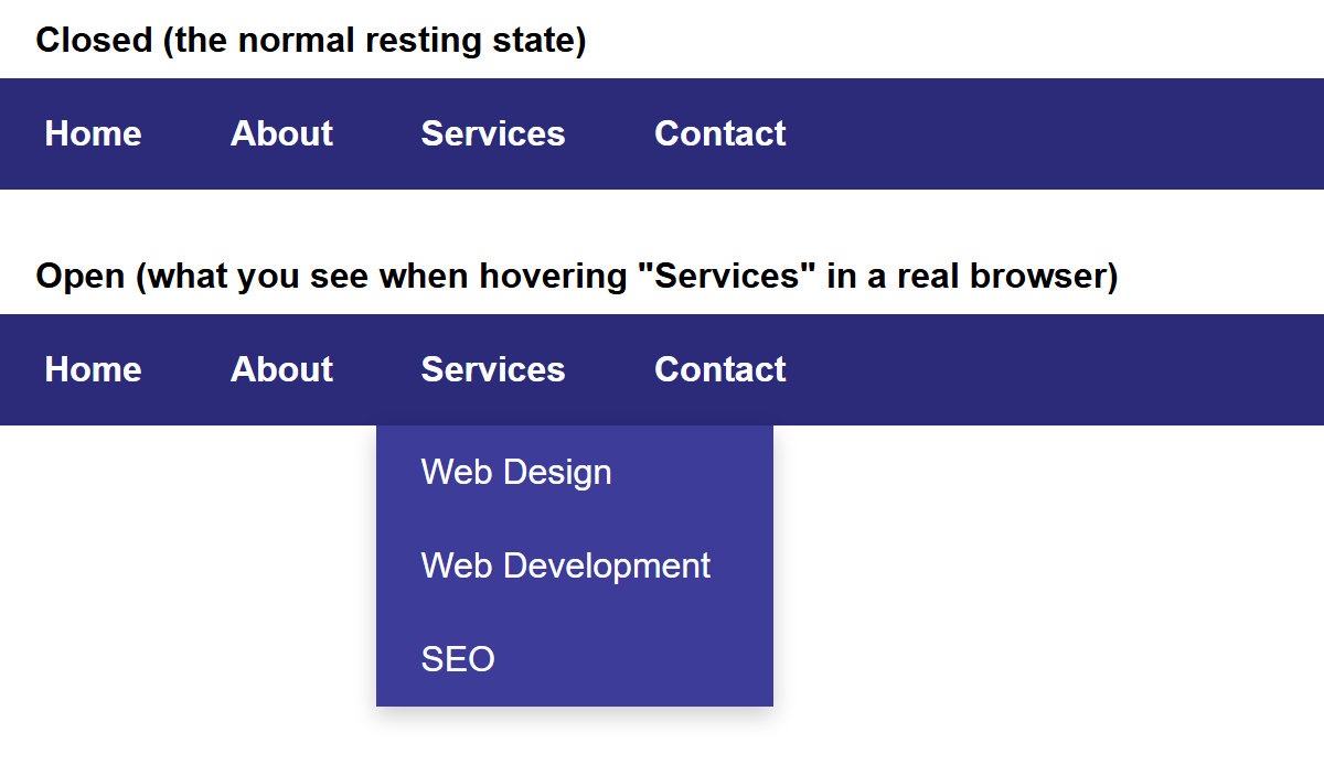
You can't screenshot :hover
The "open" state above was captured by adding a second, separate copy of the markup with the dropdown's CSS forced on — a still image can't show a mouse hovering. Try the real thing yourself: open the finished page in a browser and move your mouse over "Services".
Now the important part — walking through exactly why this works:
.nav-level-1 > li { position: relative; }— this is the single most important line in this whole tutorial. On its own,position: relativewith notop/leftset changes nothing visually — the<li>stays exactly where it was. What it does do is make this<li>a positioning context: any descendant withposition: absolutewill now be positioned relative to this element, instead of the whole page..nav-level-2 { position: absolute; top: 100%; left: 0; }— the dropdown is removed from normal flow and placed relative to its nearest positioned ancestor, which (thanks to step 1) is the<li>it lives inside — not the<body>, not the<nav>.top: 100%means "start exactly where your positioning context's box ends" — in other words, snap to just below the<li>.left: 0aligns its left edge with the<li>'s left edge.display: none;by default, and.has-submenu:hover .nav-level-2 { display: block; }— the dropdown is hidden until the mouse hovers anywhere inside.has-submenu(which includes both the "Services" link and, once it's visible, the dropdown itself), at which point it's shown.
This is the entire pattern behind a two-level dropdown menu: relative on the parent, absolute on the child, hidden until hovered.
Part 3: Going Deeper — Your Turn
Real menus sometimes go a level deeper still: hovering "Web Development" inside the Services dropdown might reveal a third level — for example, "Frontend" and "Backend." This tutorial deliberately does not give you the finished code for this part. You already have every idea you need from Part 2; the challenge is applying the same pattern one layer deeper, with one new wrinkle.
Here's the scaffold to start from — notice it's structurally identical to Part 2, just nested one level further in:
<ul class="nav-level-2">
    <li><a href="#">Web Design</a></li>
    <li class="has-submenu">
        <a href="#">Web Development</a>
        <ul class="nav-level-3">
            <li><a href="#">Frontend</a></li>
            <li><a href="#">Backend</a></li>
        </ul>
    </li>
    <li><a href="#">SEO</a></li>
</ul>
/* You already know this part from Part 2: */
.nav-level-2 .has-submenu {
  /* what single property from Part 2 needs to go here, and why? */
}

.nav-level-3 {
  display: none;
  position: absolute;
  /* top: 100%; left: 0; worked for a dropdown appearing BELOW its parent.
     A third-level menu appearing below a dropdown item would run off the
     bottom of the second-level box, or overlap awkwardly with the item
     below it. Real menus solve this by opening the third level to the
     SIDE instead of below -- a "flyout." Which two properties would place
     this menu directly to the RIGHT of its parent <li>, instead of below
     it? (Hint: think about what "top: 100%; left: 0" did in Part 2, and
     what the equivalent would be for the left/right edge instead of the
     top/bottom edge.) */
}

.nav-level-2 .has-submenu:hover .nav-level-3 {
  display: block;
}
Questions to work through as you fill in the blanks:
- Part 2 needed
position: relativeon.nav-level-1 > li. What element does the third level need that same treatment on, and why — think about which element the third-level menu should be positioned relative to. - Part 2 used
top: 100%; left: 0;to snap the dropdown below its parent. What combination oftop,left, and/orrightwould snap a menu to the right edge of its parent instead of the bottom edge? (There is more than one way to write this.) - Once you have it working, try hovering all the way into the third level, then moving
your mouse straight down — does the menu stay open the whole time, or does it close
partway through? If it closes too early, look again at which element's
:hoveryou attached thedisplay: blockrule to. - What happens if you keep going — could you nest a fourth level using this same idea? Is there a point where this pattern stops being a good user experience, even if it still technically works?
Try It Yourself
- Complete the third-level flyout menu from Part 3.
- Add a small transition so the dropdown fades in (
opacityand a shorttransition) instead of snapping open instantly — see the CSS Animations tutorial for thetransitionproperty. - Add a text arrow (for example
▾) after "Services" to hint that it has a dropdown, and rotate it when the menu is open. - As a pure-CSS, keyboard-accessible bonus: research the
:focus-withinpseudo-class and try using it alongside:hoverso the dropdown can also be opened by tabbing to it with a keyboard, not just a mouse.
Key Takeaways
- A dropdown menu is built from exactly one CSS idea, applied consistently:
position: relativeon the parent that should "anchor" the menu, andposition: absoluteon the menu itself, so it positions relative to that anchor instead of the whole page. top: 100%is a common trick meaning "start right where my positioning context ends," which is how a dropdown snaps to just below the item that opens it.display: noneby default plus a:hoverrule that switches it todisplay: blockis the simplest way to show/hide a submenu with no JavaScript at all.- The same relative/absolute pattern works at any depth — a third-level flyout is not
a new technique, just this one applied one level deeper, typically opening to the side
(
left/right) rather than below, so it doesn't run out of room.